Showing posts with label branding. Show all posts

Sunday, 11 November 2012

Walk round and smell the coffee II


WHAT A DELICIOUS SMELL OF COFFEE! How often has this thought flashed through your mind as you walked down the street? For never was there a fresher, more appetising smell  than that of freshly roasted, freshly ground coffee. Coffee for breakfast - delicious, fragrant,  whether it accompanies rolls, or bacon and eggs. After the midday meal, helping your digestion;  the perfect accompaniment to the evening meal,  mellowing the day's memories, reviving flagging  energies and brain. Magical Coffee! And here you can obtain the choicest Coffee  to suit your every need - carefully and expertly blended,  from the finest crops of the world, freshly roasted,  freshly ground, ready for your enjoyment.  at 2/4 lb Note the address:  Herbert G. Took The Best Market 18, Bridge Street, Halesworth Phone 95
1941 advertisement


After my perambulation around Southwold to audit the range of coffee vendors that might have to compete with the Costa coffee chain expected to open there, (opened in Feb 2013) I thought in fairness I should also have a look at closer to home in Halesworth.

Once again this is a purely subjective personal opinion of how tempting the coffee vendors in Halesworth's Thoroughfare and Market Place are to customers in the same food sector as Pret A Manger, EAT, Caffe Nero or Costa.

I did not undertake a taste test of their wares but I went to see how they presented their offer with an eye that the customer may have young children or be elderly and so have concerns about accessibilityGiven that Halesworth is enthusiastically involved in the Mary Portas project, I hope these comments and any criticism felt is taken in the spirit it is intended.

If there are any errors in this I welcome additions and corrections but this is based on what information was available in the field.


opening hours

I made the chart above from the visible information of the hours of operation of places that obviously serve a decent coffee. Like many small towns, there isn't much to do in Halesworth in the evenings apart from go into the pubs and restaurants, though at one time Halesworth boasted a cinema and a pool hall. The New Cut Arts Centre has been a real boon as it offers an inexpensive non-alcoholic alternative to pub entertainment. The recent opening of the Bay Tree Bistro and Number 10 has extended the range of dining choices too. The Angel has a covered courtyard space if you don't want to go to a bar or out for a meal in the evening.

During the day in the Thoroughfare a visitor has a choice of seven establishments. In the Market Place there are another two establishments and a little further way, the Co-op supermarket has a coffee shop as well.

The Thoroughfare

In the approaches to the pedestrianised Thoroughfare from the car park (which a campaign by local people recently has won free parking) several establishments have signboards but I think these contribute to visual clutter and are potential hazards for pedestrians, cyclists and buggies. It might be a idea for the town's Portas Group to provide a fingerpost board pointing to all the food and drink establishments at the car park exit? 

Coffee Shops

In the midst of the Thoroughfare the White Hart Pub is well placed to capture the pedestrian traffic passing its door. At the time of writing, its tied brewer Adnams was advertising this tenancy saying "the White Hart successfully balances the needs of both drinkers and diners." That's an honest assessment. It remains open and is popular. I didn't find an official website for it. Comments on social media rate highly its steak and mushroom sandwiches.


The White Hart - pub meals

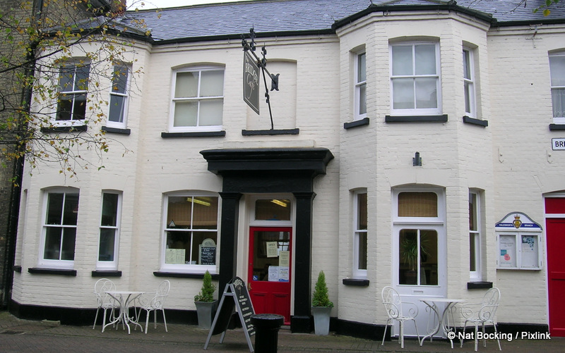
Baytree Bistro - smart but not stiff, morning coffee, evening bistro
In July 2013 with much regret and much disappointment the Bay Tree Bistro announced its closure. Their lease was up for renewal and while its terms were reasonable, the general trend of declining footfall and strong competition did not give the proprietor's the confidence to continue. While the Bay Tree could hold its own for quality, their margins were probably too slim to survive offering such quality with the opening of another two restaurants in the town. An increasingly crowded marketplace ought to be a case study for the benefits of a free-market, sometimes the customer doesn't always win.

The Bay Tree Bistro occupies one of the oldest buildings in Halesworth and is reputed to be haunted. It stays open late on Wednesdays to Saturdays but shuts at 5 pm on Monday and Tuesday. Closing time really depends on demand, the proprietor Kim tells me. Follow @baytreebistro on twitter for news. The exterior is so attractive it might give the impression that its too smart for a casual coffee unless you see customers sitting in the window seats. It often has themed events or live music in the evenings and has grown to become one of the social centres of the town. The loo is via a narrow staircase but otherwise this ancient building doesn't have major disability access issues. 


Bridge St Cafe - big inside and popular with walkers and cyclists, catches the breakfast crowd
The Bridge Street Cafe is one of the earliest opening eating places in the Thoroughfare and it is popular as a breakfast and lunch rendezvous with walkers and cyclists coming in for meals prepared by its second generation proprietor Annabelle who has taken its menu a notch or two up from the days of yore. The smallish windows make it hard to pitch its wares but there are signboards outside. No official website. Telephone 01986 873 236


Cafe Frapa - casual coffee shop
New arrival Cafe Frapa has taken over a space which has been in the recent past a furniture shop, a cafe/art gallery and historically this was the haberdashers store. It's ideally suited to be coffee shop/art gallery again. The full length curved windows of its storefront (which is listed) makes it easy to see the barista coffee, snacks and desserts on offer eat in or to go. It is easy to access and kid friendly. They serve local Paddy & Scott's coffee. Like The Cut, it has wi-fi too. They have a Facebook page.

Edwards - restaurant/coffee shop and home made pastries too
Edwards Restaurant only has a narrow frontage to pitch its traditional home-cooked food made with local ingredients but they've done their best to tempt customers (it is much bigger inside than it looks). Tripadvisor's good reviews reflect personal attention Karen and Kevin give each customer. They can serve any drink to take away whether filter coffee, lattes and cappuccinos, hot chocolate, frappĂ©, milk shakes and tea. It is kid and access friendly. Follow on twitter for special offers and local gossip at @karen4prime

Focus - deli, gift shop, organic grocer, health foods and coffee bar
Focus Organic is a Halesworth institution. Some people tell me it's what first attracted them to the town, some tell me it's what prevents them leaving as it is a social club for people with wider views than traditionally found in Suffolk.

The barista station near the front window and the customers sitting outside makes the artisanal coffee offer obvious though the seating offer is only outside. It has a wide range of savoury and sweet deli items too. There is a gift shop at the back of the store with a space-time wormhole into which pocket money and spare time vanish. If you need to occupy children with pocket-money, next to the Bay Tree is an independent toy shop which local celebrity Emma Freud rated as one of her top ten reasons to live in Suffolk, and described the area around her home in nearby Walberswick her 'foodie heaven'. 

It is evident from the touches like stained glass, well displayed merchandise and the olde-worlde-while-contemporary feel overall that the proprietors have a great deal of aesthetic sensibility and recognise the value of such attention to detail.


Angel Hotel - a bar, restaurant and courtyard cafe cover all the bases
The Angel Hotel is an old coaching inn with a popular bar, restaurant and covered courtyard area. While its coffee offer isn't quite as obvious as other places, the pizza menu signs inform the passer-by that it offers more than pub fare. The local business association hold regular breakfasts here and on Friday nights the bar is packed with mate-hunting young people. The covered courtyard is a pleasant place to have coffee and a snack without taking children into the bar.

Market Place

Pinky's - barista cafe and poetry venue 

At first glance Pinky's might appear not to be in the artisanal coffee sector but it has a barista range and does a good range of home-cooked meals and snacks. Perhaps some window lettering of 'cafe' would help it catch the passing vehicle traffic as it faces a junction. The entrance has a step down so its interior is lower than the street level but it is spacious inside. The food cabinets and counter would be more obvious if the blinds were kept open and the windows weren't cluttered with posters at eye-level - though that's a welcome amenity. It often stays open longer than the hours on the door if there are enough customers or the town is busy with an event. It is also the venue for regular poetry evenings. No website. Telephone 01986 874 243

Number 10 - upmarket dining but serves coffees and cakes all day
Number 10 closed in March 2013. The premises have now become Tilly's, formerly a Southwold institutionNumber 10 isn't in the most ideal position to catch the eye of pedestrians or passing road traffic but it has a commanding presence in the town's Market Place, which does have a weekly Wednesday market. They serve good coffee and cakes and cream teas through the day as well as lunch and dinner. Proprietor Sam Goodbourne has greatly expanded Halesworth's dining offer with local produce and has refurbished an important building that was utterly wasted as a pet shop. This restaurant may be the anchor the Market Place needs to develop a hub for good local food and entertainment. There are a couple of restaurant properties nearby that would be ideal for redevelopment.


The Cut - art gallery, theatre, music, food, drink and good coffee


Halesworth's community arts centre The Cut is also in a relatively poor position to attract passing foot and car traffic but it does try by posters and a sign board and leaflets to get train passengers at the nearby station. It is the only place in Halesworth with both good coffee and wi-fi and comfortable sofas so gets my recommendation at every opportunity for a social or business meeting. If there is an event on in the evening the cafe will stay open to the interval. There is a pay car park a few yards away.

In summary, in my opinion, the casual social coffee drinker on a budget is very welcome in Halesworth and is assured satisfaction. All the establishments make a clear offer of their product, all seem to be child friendly and there are very few access issues. Coffee drinkers around here don't go for much barista art but if the demand was there, I am sure Halesworth's coffee shops could meet it.

hwww.beyondthebean.com

Local coffee

Although the beans have to travel many food-miles, there are at least four five local coffee roasters and blenders in Suffolk who supply local establishments and employ local people, including one right in Halesworth. Please patronise them and ask your vendor where your coffee comes from.

Freshpac Ltd
freshpac.co.uk
@FreshpacSales
founded 30 years ago by Gerald & Queenie Salter in Halesworth

Deepmills Coffee
www.deepmills.co.uk
@deepmillscoffee
Jonathan Draycott & Mary Mummery in Melton

Suffolk Coffee Company
www.thesuffolkcoffeecompany.co.uk
@suffolkcoffee
Christopher Rayner-Green in Peasenhall

Paddy & Scott's
www.paddyandscotts.co.uk
@PaddyandScotts
Paddy Bishopp and Scott Russell in Earl Soham


Thistledown Cottage
www.thistledowncottagecoffee.co.uk
@nevertocaffiena
Gary Rothwell in Broome near Eye

The future

Tourism marketing logo

Halesworth prides itself that it is still a working market town. There is a weekly market and regular home-produce markets. There is a very good range of independent shops with high quality butchers, greengrocers, delicatessens, hardware and most other services available but they face competition from the major supermarkets nearby. A shop selling sporting goods, phones and cameras recently closed because it couldn't compete with the supermarkets in Beccles and Saxmundham.  It appears that a logo was created to market Halesworth and the others in the Blyth Valley with a brand identity but I couldn't find its author online and it certainly isn't applied with any consistency. An attractive directory of local food was recently published highlighting the comprehensive range and quality of what's produced within ten miles of the town, positioning Halesworth clearly as a centre for quality food.


Tourism promotion pitched at food lovers

Though on the 'wrong' side of the A12 for tourist traffic, the train station offers visitors access to Southwold and the coast with a bus connection. Halesworth is also a popular base for cycling holidays, being surrounded by a network of quiet routes to the coast and many excellent rural pubs. There is a volunteer-run bus service offering a daily 'Hoppa' service around the town and to nearby villages. Most of the housing is still occupied by local people but second-homers are gradually discovering the area. There are two large industrial estates and several creative businesses and international charities based in the town and a great number of creative home-workers and artists enriching the town's life and filling several art galleries.


Halesworth in Transition's food directory

I have considered it would be worthwhile for the town to promote itself as a place for small conferences and social or business meetings, along with the retail offer in the town, so I have encouraged various places that have meeting facilities, such as projectors, wi-fi and conference rooms, to produce a community event directory. The number of places for coffee or lunch would also be worth including in this directory. However some local organisations need to work together. While the town council can still be bullied into putting up plastic bunting when the community had made its own, many people's imagination and energy is not forthcoming.

With the Latitude Festival and the High Tide theatre festival and its own month-long arts festival as regular fixtures, although Gig in the Park fell victim to rising ancillary costs, in the long term Halesworth is likely to see more coffee drinking bohemians drawn to the town. It may have the potential to become another Totnes or Stroud, where traditional agricultural enterprise mixes with creative ones and invigorates a declining community.

I reckon as the town's footfall is not high enough for Costa's model, the present coffee shops can breath easy for now. The biggest threat to its independent shops would be another supermarket in the town. So far Halesworth has been able to prevent the incursion of Tesco who have purchased a large site next to the current supermarket and while local opposition has been strong and planning permission was refused at the last appeal, Tesco and some local people keen to profit from the situation haven't yet given up.

Other outlets

There are several other Halesworth food outlets which don't make an offer of artisanal coffee:

The Seashell - fish & chips
The Swan - live music, sports pub
Raiputh - Indian restaurant
Singtom Neeyom - Thai restaurant
Halesworth Fish & Chip Shop - take-away
Golden House - Chinese take-away
Hong Kong - Chinese take-away
Istanbul  - burgers, pizza and kebabs take-away
In the carpark of Ridgeons is a snack bar that is open from 7 am.

A wide range of other goods and services are listed on the Halesworth website


Monday, 4 February 2008

Fully Loaded

Up to January 31, 2008 when I noticed that the posters that had been up had disappeared, Kentucky Fried Chicken had on Norwich bus shelters (which are part of Clear Channel Outdoor) and local point of sale a poster showing a KFC meal served in a open sardine tin with the tagline: Fully Loaded.

I shall attempt here to deconstruct this poster for clues into its meanings and the likely reasoning behind the creative decisions made in this campaign and my impressions of it.

KFC is a brand leader in the global fast food market and ensures its market share against stiff opposition with a huge advertising budget, which in 2001 was 787 million USD. Therefore I would assume that KFC consider every piece of brand communications very carefully and would subject their campaigns to rigorous analysis rather than rely on the gut instinct of advertising creatives.

It appeared to me, as a pedestrian and bus rider, that this campaign was limited to the local area. I had the opportunity to visit nearby Lowestoft in the same week where there was no sign of this campaign. References I found with Google indicate that this campaign is for a limited time meal combination that has been marketed elsewhere.


The 'Fully Loaded' tagline is by no stretch original copywriting as it is presently used by the US chain Checkers and Campbell's Chunky Soups and as a movie title. The phrase is a cultural artifact in its own right. Although it has many associations, the meanings are generally consistent and the other uses do not present any obvious liability, rather more, they reinforce each other. It's most common usage is to describe automobiles that have all the optional features included therefore it makes the promise: nothing has been left out. It signifies abundance. The phrase is catchy and evocative shorthand, everything that a slogan should be.

The first impression I had of this advertisement was of ambiguous messages which I suspect are intentional. The visual and textural elements combined to express both concrete and abstract terms. Rationally this poster is an explicit pitch emphasizing the convenience, quality and value of a combination meal by signifiers with concrete meanings but the poster is also rich with implied messages that are dependent on the imagination and culture of the viewer. I shall try to expand – with my layman’s grasp of semiotics - on just a few of the signifiers in the following matrix.

Concrete promises

  1. Price by price sticker
  2. Quantity and forms of food and drink by images and text descriptors
  3. Quality of food by images of real food
  4. Appealing flavours of food by text descriptors
  5. Appealing textures of food by images of real food
  6. Value by combination of quantity and price
Abstract promises

  1. Convenience by sardine tin metaphor for take-away container
  2. Convenience by angle of view of products
  3. Good Value by over-filled sardine tin
  4. High quality by KFC brand reputation
  5. Quality by colour scheme significance

Decoding abstract or hidden meanings depends on the viewer's interpretation and hard evidence is almost non existent but it is understood that advertising influences the conscious and subconscious mind and it can alter behaviour without the recipients being aware of it [2]. The New York Times reported that "new studies reveal a subconscious brain that is far more active, purposeful and independent than previously known.

The effect of advertising messages on a subconscious, emotional level is something I am confident a multi-national corporation such as KFC would have some knowledge of; either by reference to scientific research or trial and error but it is for the reader to decide where KFC's messages are pitched and where they are landing.

The poster’s offers are a inelegant construction where the key promise is deduced from a quality that is emphasized with visual metaphor and the tagline to compare the price. The central conceit of using a sardine tin as a metaphor for the box meal is, to me, meant to convey that the portions are generous and reinforced with the tagline; that conveys "nothing is lacking" and when compared with the price given, the viewer would deduce that X quantity + Y price = favourable value. The visual metaphor used here is often used elsewhere(see example given) for overcrowding - such as in rail passenger rights campaigns - and here it implies there is too much food for the container it comes in, which reinforces the price/quantity comparison.

However, the visual metaphor of the sardine tin used as a tray or take-away box did not communicate these meanings directly to me. It took a moment to decode what this meant as a whole. I would posit that this choice of metaphor was not overtly an entirely successful one. The sardine tin as a metaphor has some liabilities.

I offer its Wikipedia entry as evidence of the ubiquity and variety of the sardine metaphor; Sardines occupy a unique position in our shared cultural and literary heritage. This is mostly because of the interesting way that they come to us: packed tightly in cans which once upon a time were opened with an external key. From this image we get the ubiquitous phrase, "packed in like sardines." Sardines packed in their tins present an image of the organic oppressed by the inorganic which has frequently struck a chord with artists and social commentators. We see this image constantly in art and editorial cartoons; we even hear about it in Radiohead songs. Playwright and comedian Alan Bennett memorably used the image of a sardine tin as a metaphor for life (where we have lost the key).

I find it interesting that the sardine tin motif was not carried through on to the serving box and it has eluded me to find any use of another context combining metaphors 'crowded like sardines' and 'loaded with features' so I would say their connection is original but this construction is so jarring in its visual grammar (as in Leborg's book of the same name) that it takes on a surrealist quality.

The small size and discrete placement of the price sticker on the poster suggests that something else is being promised. As price is being underplayed, I suspect that quantity of food for the price it is not the only feature or benefit and some other more abstract meaning is intended.

An aspect of the sardine tin iconography that I should like to decipher is the rolled back lid and its inaccurate scale to the food products. There are innumerable ways sardine tins open. The 'key' and partly rolled back lid here have a revelatory quality and this conveys (to me at least) that the products, (the bun, drink and fries), have a narrative back story as they have been unusually combined by an unseen hand inside a tin and are now unleashed. By literally surrounding the product with the sardine tin, this infers transference of the values (crowding) of the sardine tin (an object with a known purpose as a container) to the food. Promises of plenty are evoked but it is stretching the bounds of credibility as it is unusual to serve food in a relatively giant sardine tin, although it is not beyond possibility.

I presume the creative team behind the KFC ad considered carefully how a captive audience at bus shelters and the passing pedestrian would react to the juxtaposition of these unusual elements and strove to achieve a visual pun with 'sardine tin + fully loaded' that took a second or so to 'get' and such visual puns strike the right balance of challenge and reward in the fleeting window of opportunity for attention.

Comparing the 'pitch' to the product in-store by photos on flickr I found that at point of sale, the branding on the serving box makes a very different promise. Here the Fully Loaded tagline is supplemented by "now seriously satisfy your appetite" and its crane hook and chain graphics emphasize a heavy 'load' being lifted by the customer. I am puzzled to understand the relevance as a carry through from the posters of this crane motif except that cranes carry "loads"

I also question the intent of the borders of the tagline copy as I cannot see a accentuating purpose for the darts and rectangle except that it makes the tag line an imposter as a sardine tin label and it is somehow similar to an icon for a theatre or movie ticket. Could this be a subtle hijack of the awareness of the Disney movie? Another ubiquitous word association is "meal ticket" and perhaps this motif straddles the two.

It is well understood that if you can make a viewer stop and look at your advertisement twice, its message may become more memorable. Puzzles are regularly used in advertising and Honda's current campaign is based on six puzzles which have to be solved to unlock benefits. Recent research at Simon Fraser University [4] shows that puzzle solving creates a false sense of familiarity with a brand and creates a preference for the brand which must be a boon to advertising.

I find it interesting that on the poster the word 'meal' that appears in the tagline is turned sideways and so does not follow the scan of a reader's eyes and so could fail to register at the optimum viewing distance. On one hand, the both deliberate inclusion and attempt to defeat reading the word 'meal' could be to prevent any claim of infringement by the Walt Disney Company or other trademark holders who may have trademarked fully + loaded and so may consider 'anything: fully loaded' as an infringement. The potential for lawsuits however frivolous is not taken lightly as brand rivals seem to delight in aggressively hindering their competitors with lawsuits. Also, if the tagline on the poster and box was unambiguously ‘Fully Loaded Meal’ it does not reference so immediately the cultural connotation of feature-rich products.

The 'Fully Loaded' tagline is most likely to be connected to the popular phrase that has long been a part of American usage (reinforcing the US origin of the KFC brand) and this is culturally acceptable in the UK (although it is a recent import) but there is the possibility, as I made the connection myself, that the viewer would connect the 'loaded' to mean loaded with high fat, sugar and salt content which at the present time is a negative aspect of fast food. There is the negative connotation of ‘loaded’ as in dice being tampered with and someone is either wealthy or intoxicated if they are ‘loaded’. A play on meanings not lost on the publisher of the men’s magazine ‘Loaded’.

Today major food corporations like the tobacco companies are keen to distract consumers from any message about potential harm by their product. In this instance, the use of ‘loaded’ could appeal to males by an indirect but established connection to machismo by association with automobiles and is infer rebellion against the facts that such foods have health risks. KFC would not be the only fast food company to do this. On the Checkers poster there is a secondary tag line "fries with attitude" alledging these '"fully loaded" fries are perhaps as rebellious and incompliant as an adolescent.

A connotation (deliberate or unintentional) with risk or harm is not necessarily a bad thing when marketing a product. The example of 'Death' cigarettes with packets branded with a skull and crossbones as well as health warnings shows that people can have a perverse conscious or subconscious delight in danger and associations with risk and rebellion are constantly exploited by advertisers. Despite its admitted brand position as a joke and so likely to be a short-lived fad, the Death cigarette brand was immensely popular and it was only a ruling against its tax arbitrage scheme that lead to the brand's demise rather than any failure of the product in the marketplace with consumers.

The fast food industry as a whole has come under growing criticism for the fat and salt content of its food and its marketing practices [5] and like the tobacco companies, some have come to emphasize that the responsibility lies with the consumer to make informed choices. There is, as I perceive it, a message that something that is "Fully Loaded" appeals to a baser pleasure and subconscious hunger that fatty food satisfies. Their is research, such as John Hoebel's work at Princeton, that fried foods rich in fats are addictive. [6]

Given that it is in KFC's interest to neutralize negative associations between fried foods and unhealthy diets, the use of a sardine tin has a sinister possibility that they are using the concurrent healthy associations with sardines to visually confuse the message of unhealthy food in the way Marlboro and Camel cigarettes built associations with the healthy outdoors. Although a rational consideration would not make that association, it is the subconscious that wakes the appetite and says it is hungry.

There are other subtle hints that KFC considers these issues. This poster uses the recent redesign of KFC's Colonel Sanders trademark and I notice that part of the colonel's makeover is to switch his clothing from a coat and tie to a kitchen apron. As a KFC logo redesign would not be considered lightly, perhaps this was to emphasis that KFC products are cooked and to use the connotations of home and friendliness as well as freshness and by extension health that kitchens have.

I also consider it important to notice that the sardine tin and food products appear photographed (although the sardine tin looks digitally constructed) in a red infinity cove. This colour has obvious brand associations but also the setting evokes an atmosphere of both the film premiere's red carpet and a show room.

Kenneth R. Fehrman, a professor of interior design at San Francisco State University and co-author of 'Color, The Secret Influence' states that red, a color often used in advertising, is proven to cause an increase in heart rate and blood pressure, thereby increasing a person's tendency to make impulse purchases. It is unlikely to be an accident that all the major fast food outlets utilize red predominantly in their colour schemes.

The red carpet is another icon with many useful meanings that KFC might want to associate with its product. The history of these associations is as old as ancient Greek myths. Agamemnon was tricked by his wife into walking across a red carpet fit only for the "feet of the gods." We generally associate a red carpet now with celebrities and royalty and premieres of special events. Something on a red carpet has status.

There is also a message in the visual grammar of the angle of view the view has of the product on the red field. Here the viewer is slightly dominant, but close to neutral, which suggests subconsciously that the product is passive and harmless and within reach. When advertisers want to signify strength and robustness, such as for heavy trucks, or success and aspiration, they tend to raise the product to dominate the eyeline of the viewer. To convey intimacy and smallness, the viewpoint is most often downwards. The sheer quantity of discourse on this subject proves alone that such considerations are far from trivial.

1 Fast Food Nation: The Dark Side of the All-American Meal (2001) Eric Schlosser

2http://www.nytimes.com/2007/07/31/health/psychology/31subl.html.

3 The Contextual Effect of the Local Food Environment on Residents' Diets: The Atherosclerosis Risk in Communities Study - Morland, Wing & Roux

4 Journal of Applied Cognitive Psychology, Unscrambling words increases brand name recognition and preference, Volume 20, Issue 5 , Pages 681 - 687

5 Super Size Me - Morgan Spurlock.

6 http://news.bbc.co.uk/2/hi/health/2707143.stm